Sunday, September 25, 2005

Motorola ROKR, the iTunes Phone, Now Available in Singapore

Motorola ROKR is finally on-shelf all over Singapore!

For those who don't get it yet, Rokr is basically a iPod Shuffle married with a phone jointly created by Apple and Motorola. Is it as good as a bona-fide iPod? Yes and No. It has the familiar menu style found on iPod and promises a seamless AutoFill like that of a Shuffle, but there is no click wheel. An iPod in a phone is a fine idea, but you may ask whether you would be charged for a premium price for it.

My findings so far show that the retail price is at around $588. If you are about to renew your contract and don't mind a 2-year plan, the prices at the major carriers are as follow.

Looks like M1 is the winner.

Below are some images of Rokr. As you can see, it looks almost identical to Motorola E398. In fact, it is based on E398, except with a couple of enhancements like built-in iTunes capability and enhanced screen. Check it out at CNet for a complete coverage.

The familiar iPod-style menu.

Hot-button for easy access to your music.

Headphone jack supports standard 3.8mm adapter.

What is so special about ROKR?


Since Rokr is based on E398, a stable and discern but a little old model, it is safe to think that the phone functionalities are rather capable. The focus here is not about the standard phone features but the new iTunes capability and what it means to you. Note that if it isn't the unbeatable easy-to-use iTunes program that makes managing thousands of tunes a charm, the iPod will not be what it is today as an acronym of portable music player. In the exact same way, what sets Rokr apart from other semi-MP3 phones is the original iTunes experience that millions of iPoders love so much. If you are one of those one-gadget-for-all dudes and want to experience the iPod's way of life, ROCK ON!

Yet another Mac tip is on the web!

Thursday, September 15, 2005

Dictionary Everywhere!

A quick check: Should you need to look up for word definitions while reading webpages, where do you usually start?

  • a brick-size granddaddy dictionary?

  • a bite-size pocket dictionary?

  • a PDA?

  • dictionary.com?

  • Google? (type "define: xyz" and hit SEARCH)

  • ask mommy?


Well, here's the catch. Look no further than your Mac, if you already have Tiger (Mac OS 10.4) installed on it.

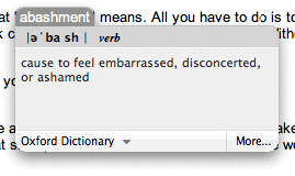
Here's how. Let's say you are not sure about what "abashment" means. All you have to do is to place your mouse pointer over the word, and click ctrl + command + d. Go on, try it. Bing! Without typing a word, you got your answer already!
dictionary pop-up widget
Not impressed yet? Now try this. While you bring up the pop-up thingy, don't let go of the ctrl key. Move your mouse around, you'll see that whatever word the mouse comes across shows its pop-up definition as well!

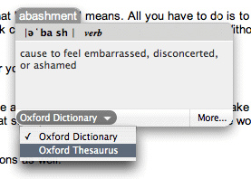
There is a handy menu on the pop-up widget for you to switch between word definitions and thesaurus.
switching between dictionary and thesaurus
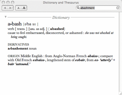
If you click on "more" on the bottom-right corner, it will launch the actual Dictionary application. Make no mistake that it is housing the Oxford American Dictionary! That shall provide extra confidence boost in the word definitions you get.
Dictionary application
Besides Safari (for non-mac user, that's Mac's default nifty web browser), you can apply the trick to these applications, just to name a few. Note that in some applications it only works when you are editing the text, e.g. when editing an entry in iCal.

  • iLife series (iTunes, iPhoto, iMovie, iDVD, GarageBand)

  • Text Editor

  • Adium

  • iCal

  • Address Book

  • Mail

  • Dictionary (ironically)


For the other thousands of applications that don't get mentioned here, the trick may or may not work. At any time you can try the trick on any of them to see for yourself. If it works, it works. If it doesn't, then someone's got to do a better job!

Further tips


I find the default short-cut key rather awkward, because it requires me to twist my wrist in an unnatural way. Luckily, Apple has made this customizable. It's much better now after I changed it to ctrl + d.

Yet another Mac tip is on the web!

Monday, September 12, 2005

iPod Nano Tested, Hands-on!

iPod Nano
Macnify has had a hands-on review on iPod Nano! Yes, nothing is more exiting and appropriate than discussing the new Nano in this debut topic on Macnify.

What is Nano? In short, it is a replacement of the blockbuster iPod Mini digital music player. The differences? A quick list of items would be 1) the physical dimension of Nano shrinks by a few orders, 2) the display is upgraded to a color screen, and 3 ) flash memory in the sizes of 2GB/4GB is used in place of the hard drive. What remain unchanged are all-things-iPod including the familiar layout of click-wheel user interface, and the price tag. Among all the changes, the two most obvious ones have got to be the nano-scale body and, well, the nano-scale color screen.

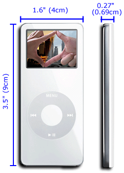
Nano-scale body with color screen


The power of the full-featured iPod is packed in a card-size body of 3.5" x 1.6" x 0.27". That's about four to five credit cards' thickness, and about two-third of a credit card's surface area. Its weight at 1.5 ounces is twice that of a Shuffle, therefore it does not go as unnoticeable as the later when tugged into your jeans. Still, the feeling I get while holding it in my hand tells me that this is a true light-weight gadget.

The 1.5", or 172pixel x 132pixel color LCD works fine for normal iPod operations, but is a little demanding for viewing photos. However, the colors are dynamic, and I find it much better than most of the mobile phones out there in terms of sharpness. Although it is not much fun seeing pictures on a screen that small, the speed of decoding images is awesome (read: instantaneous). That makes scrolling through images painless.

It is to be noted that, years ago Apple ditched the physically rotating click-wheel in favor of the touch-sensitive one. This brought at least two advantages: 1) elimination of physically damages by doing away with moving parts and 2) reduction size. In this episode with hard drive being replaced by flash memory, Apple has again achieved the similar results. In fact, the moving arm found in the hard drive is about the last moving object in an iPod, and by removing it Apple has eliminated all possibilities of product failures due to broken joins of moving parts.

For the complete specifications, see the official Nano site.

Sound matters


Since it wasn't possible for me to test the audio quality (I tried out the Nano at a noisy local Apple store where the staffs were blasting music off the demo set through powerful suonddock), I could not comment on it. A quick look up on other iPod-centric websites tells that it is apparently too early for anyone to have a serious test run on the audio issue. I would recommend you to keep a look out on playlistmag.com for any future review on Nano's sound performance.

My guess is that, it would be on par with, if not better than, the Shuffle and the latest iPod Photo. Apple has always been critizied for iPod's rather flat sound quality until they finally pulled it off with these two products. It figures that Apple will put the lessons learnt into Nano. Still, I am only guessing.

Sticking to the iPod Legacy


With Nano, Apple has made its statement of its ability to migrate the guts found in big-brother iPod Photo while pushing the limits in miniature design. You will find the same software user interface, the same click-wheel configuration, and the same dock connector, all nicely placed in the familiar layout. Until Apple finds ways to improve any of these features across the board, Nano's consistency with the standard iPod platform can only be a good thing. It means that with Nano you have virtually no learning curves to overcome, you can continue to boom music through your expensive Bose Sound-dock (or other similar products, for that matter), plus you can take it out on a jog and expect it to endure the vigor just like the Shuffle without fearing that the hard drive may fail.

Wrapping up


After checking out what are in the package, it is clear that calling Nano a the replacement of Mini is a misnomer. Some say it is a bigger-size Shuffle with a screen, but I disagree. It is in the very essence a scaled-down flash-based iPod Photo. It works (almost) like the granddaddy iPod Photo, and it is incredibly small in size. In other words, it's got the mojo! If iPod is already good for you, the only remaining question about Nano would be: is it better than ever?

Yet another Mac tip is on the web!

Friday, September 09, 2005

Hot Tips

Tips you mustn't miss!

Downloads


Dashboard


iTunes


PDF


Photos


Productivity Tips


Security

Thursday, September 08, 2005

Contact

You can contact MacNify by sending emails to macnify@gmail.com

Please avoid writing requests on the article comments. They get buried down! That said, I don't totally object to it if you really feel like posting requests as comments anyway. Just the way I go about receiving requests, that's all.

Enjoy the tips, and keep the comments coming!